Airthings
Through Airthings' new packaging system, we explore what a space with the cleanest air looks and feels like.
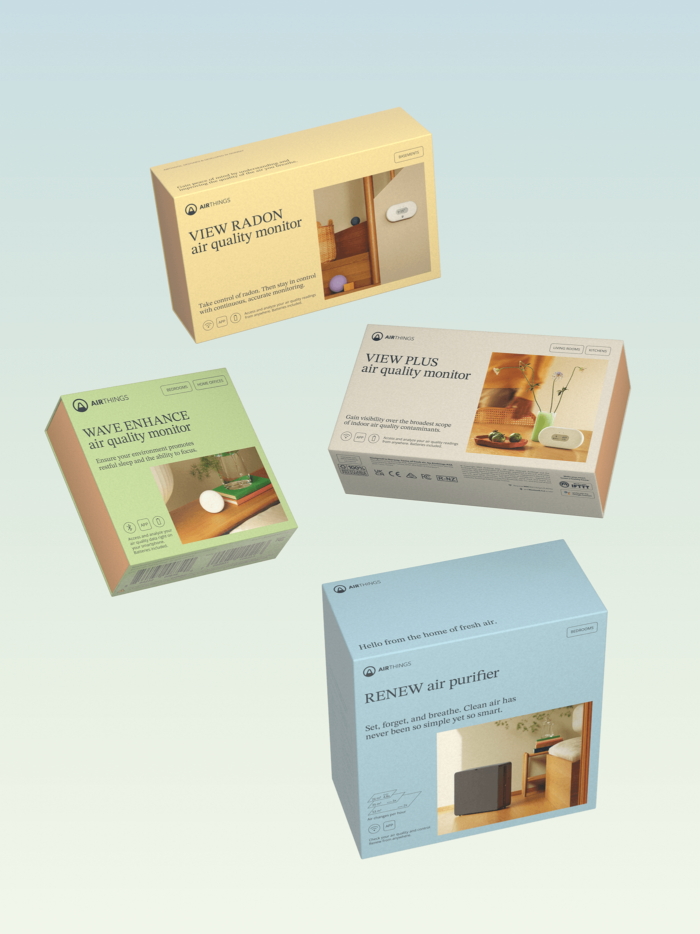
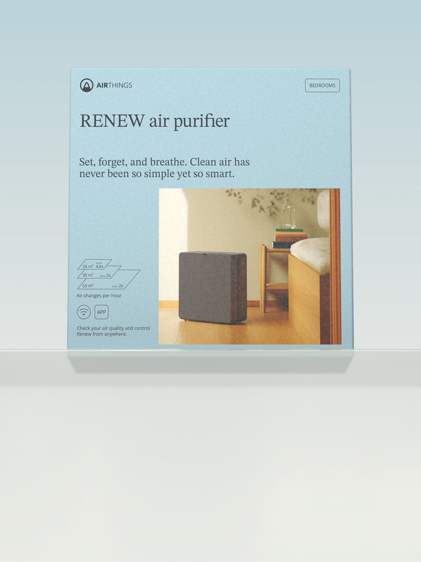
With the launch of their new air purifier in the horizon, Airthings came to us to redesign their air monitoring packaging portfolio and introduce their purifier. The design language of the category felt heavily commoditised which gave us key opportunities to stand out and speak differently. With most brands being anchored in functionality, we embarked on an emotional exploration, leading us to rethink the brand assets with a more mindful approach.
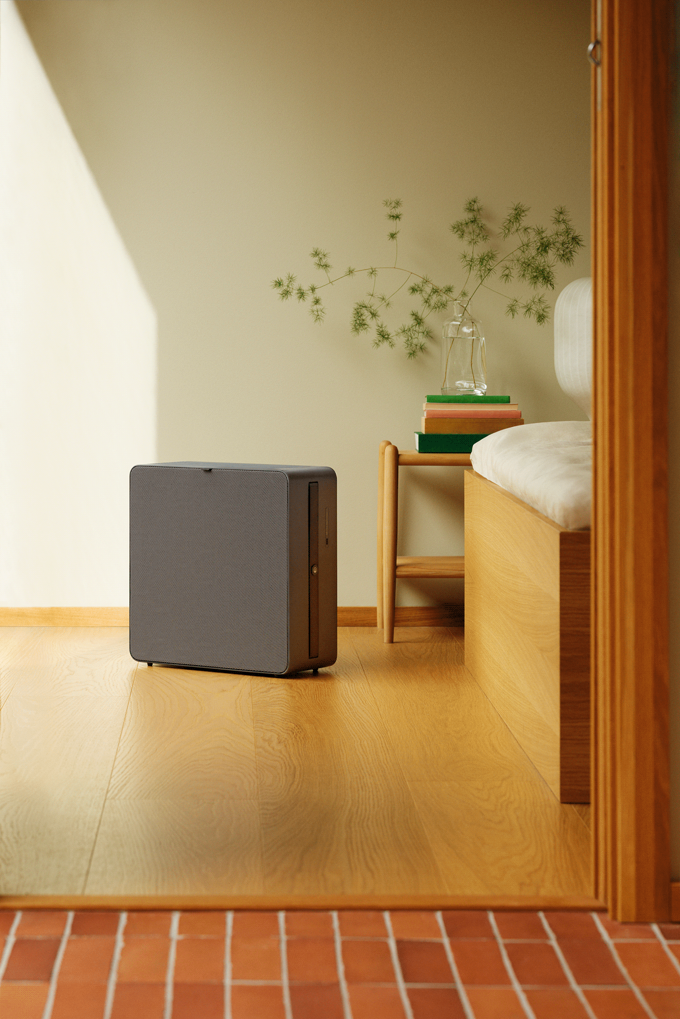
In a category filled with 3D renders or line illustrations on white backgrounds, our solution focused on bringing warmth to the devices and integrating them in their contextual spaces.
Photography by Hinda Fahre
Styling by Live Berg
3D and motion by Julie Jørstad
Renew Industrial design by Above
Styling by Live Berg
3D and motion by Julie Jørstad
Renew Industrial design by Above
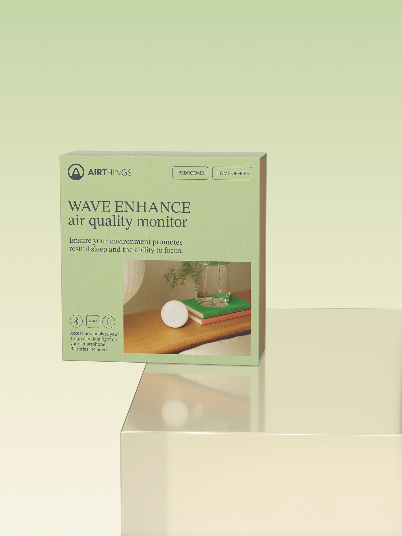
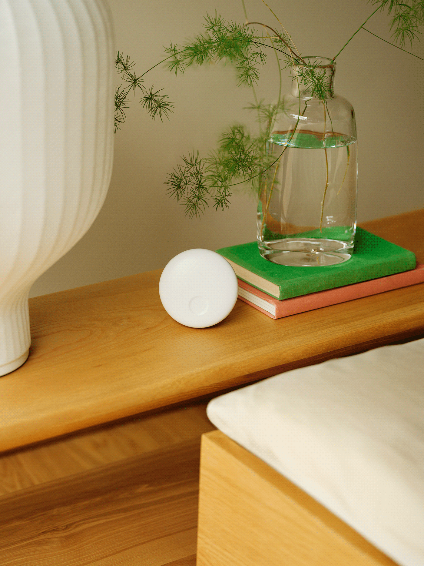
Through the photographic approach, we shifted the focus from product-centric to rather showcase an inspiring way of living. The images convey a sense of openness, freshness and overall wellbeing. The colour palette also evokes a sense of comfort and enhances the quality of the air by introducing a range of tones that is both natural and refreshing.
A serif typeface is introduced to build a stronger editorial voice and elevate the look and feel of the brand. All visual elements are breaking away from category standards and contribute towards the story of creating Space of Mind.
The result is a packaging range that is moving away from selling worries to selling freedom from worries around air quality.